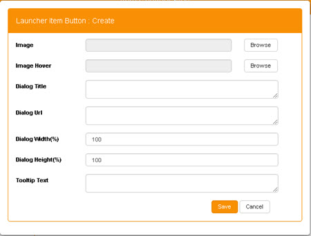
Create or Edit a Launcher Item Button
The values that determine the properties of an individual Launcher Item Button are defined when the Button is created, but can be edited later.
-
To create a new Button, click New at the foot of the Launcher Item Button grid within Item Button Configuration.
This displays the Launcher Item Button: Create window.
To edit an existing Button, first select that Button within the Launcher Item Button grid, and then click Edit.
This displays the Launcher Item Button: Edit window.
With the exception of their headers, the Item Button: Create and Item Button: Edit screens are identical.

-
Enter each of the following values:
- Image - The icon or other image that the Button will display.
-
Image Hover - An icon or other image that provides an overlay effect for the Item Button.
To select an image, click Browse to display the Image Browser.
- Dialog Title - The identifying title displayed in the dialog's title bar.
- Dialog URL - The relative path (./) (relative to the StarPM root directory) of the dialog that will be displayed when the Item Button is clicked .
- Dialog Width (%) - The Item Button tool-tip's width, as a percentage.
- Dialog Height (%) - The Item Button tool-tip's height, as a percentage.
- Tooltip Text - Text for the Item Button's tool-tip.
-
Click Save to create the new Item Button.
The Item Button: Create window closes automatically, and the new Item Button n is added to the Launcher Item Button grid within Item Button Configuration.