Create or Edit a Chart
The creation and subsequent editing of Charts is guided by a two step wizard.
In the Chart List, either:
- Click New to display the New Chart wizard, or
- Click Edit to display the Update Chart wizard.
Although their layouts are slightly different, the elements in both wizards are the same.
The first step is to create the chart's listing and define the connection with its data source (Query Definition). In the next step, the charts axes are defined. The chart can then be previewed.
If you want only to edit the chart's axes, click Next on proceed directly to that screen (Step 3 below).
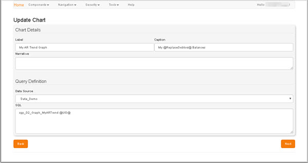
- In the Chart Details region, define the details by which the chart will be identifiable:
- Label: Enter a meaningful name or short description for the new chart. This will be displayed as the chart's Description, e.g. in the Description column within the Chart List.
- Caption: Enter a short caption for the chart. The Caption is displayed within screen headers when the chart is being edited. If no Label is specified, the Caption is used in its place.
- Narrative (Optional): Enter a concise description of the chart. This will be displayed beneath the Caption in certain screens.
- In the Query Definition region:
- Data Source: Select the data source you want the chart to report on.
-
SQL: Enter the SQL parameters that will be used to query the specified data source and populate the chart.
The SQL field is not case-sensitive.
-
Click Next to progress to the next screen, Configure Chart Series.
To return to the Chart List without making any changes, click Back.
In this screen, you must define the presentation of the chart's axes and columns, lines or pies, dependent on the chart's type.
Axis labels are displayed beneath the horizontal (category) axis, next to the vertical (value) axis, and (in a 3-D chart) next to the depth axis. The chart uses text from its source data for these axis labels, but you can change them here.
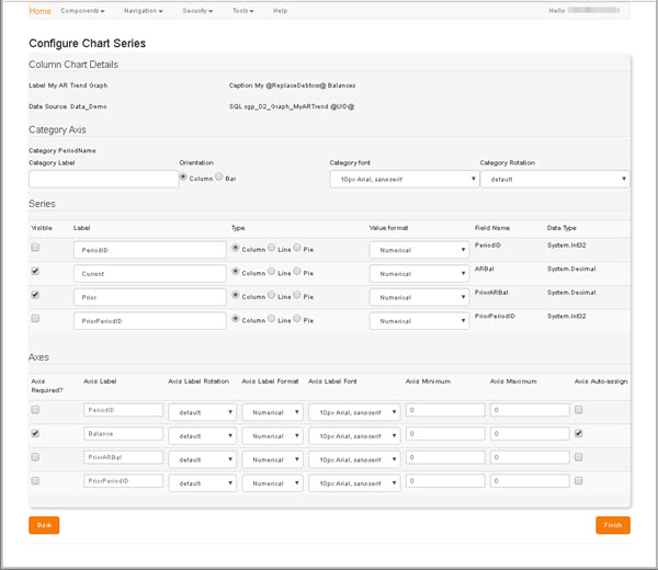
The Column Chart Details region presents a read-only summary of the details entered on the previous screen.
-
In the Category Axis region, define the presentation of the chart's horizontal (category) axis.
On the Category Axis, data is treated as a sequence of non-numerical text labels. The marker's position at a point along the axis is determinded by its position in the sequence.
- Optionally, enter an identifying Category Label for this Axis.
- Select the appropriate Label Orientation: Column or Bar.
- Select which Category Font will be applied to the Labels.
-
Select the degree of Category Rotation to be applied to Labels.
If you have many series on the axis, labels can be rotated so that they would all fit. You can rotate them by any degree you want.
-
In the Series region, define the presentation of each column, line or pie that will represent a data series in your chart.
- Select the Visible checkbox for each data Series that you want your chart to illustrate.
- Enter a short, meaningful Label for each data Series.
- Select the Format of each Series: Column, Line or Pie.
-
Select the the appropriate Value Format for each data Series.
The Field Name and Data Type values for each Series are read-only. They are as defined in the previously selected data source.
-
In the Axes region, optionally assign each series to an axis, and define the presentation of those axes in your chart.
- Select the Axis Required? checkbox for each series that you want to assign to an axis.
- Enter a short, meaningful Axis Label for each axis.
- Select the degree of Axis Label Rotation to be applied.
- Select the appropriate Axis Label Format.
- Either:
- Specify where data appears in each axis by setting its limits, Axis Minimum and Axis Maximum, or:
- Select the Axis Auto-assign checkboxthe to have the Axis Minimum and Maximum values assigned automatically.
-
With each Chart Series configured, click Finish to preserve your changes.
The SQL you entered in the Query Definition is validated at this point. If validation fails for any reason, an error message is displayed beneath the SQL field, e.g. "SQL incorrectly specified - Unable to build the embedded [Parameter] collection: ...". Any elements you include in these parameters will subsequently be listed, and can be formatted via the Element List.
Once your SQL parameters are validated, the new chart is created, and you are returned to the Chart List automatically.
To return to the Chart List without making any changes, click Back.